
Basilica Hudson
Premise
Space and place means everything at Basilica Hudson, a multidisciplinary non-profit arts and performance center in Hudson, New York.
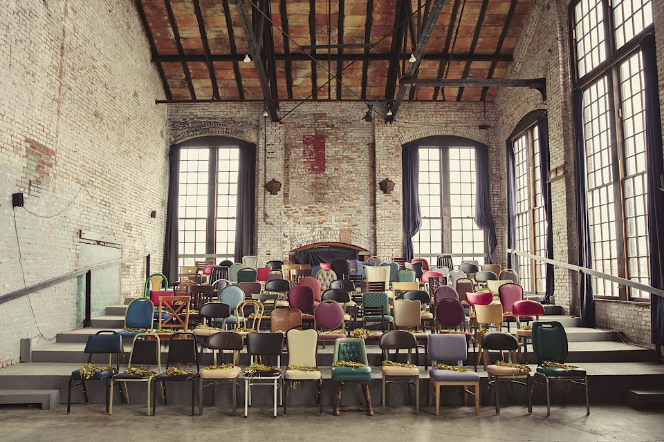
In creating its brand identity, we were thunderstruck by the eponymous basilica: a gloriously moody 1880s factory whose interior spaces are activated by all means of music, art, and cultural events. Our resulting modular brand identity reflects the center’s diverse programming.

Basilica Hudson is a monolith for Hudson, New York
Founded in 2010, it plays host to a dizzying array of music, art, and cultural events that are as unique to one another as the venue that holds them. The basilica itself has woven its way into the fabric of Hudson in many forms—from forge to foundry, knitting mill to glue factory.
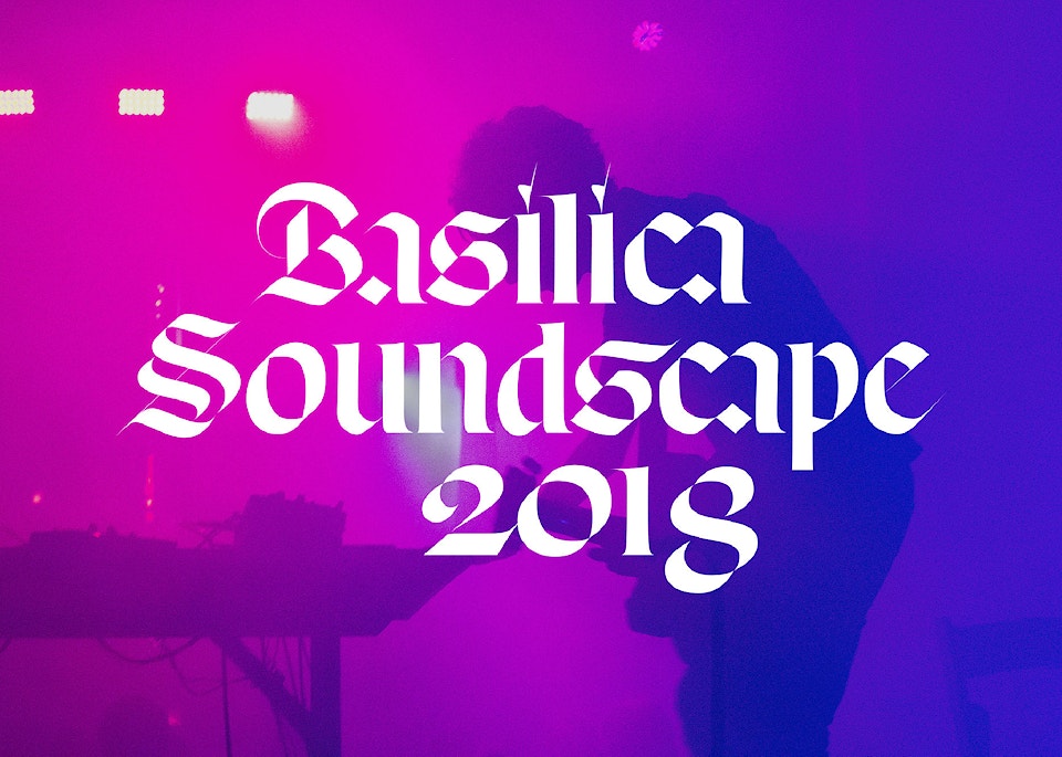
Branding for Basilica SoundScape, “the antifestival” for experimental music, visual art, and literature.


Look and feel we developed for 2018's SoundScape, prior to the rebrand.
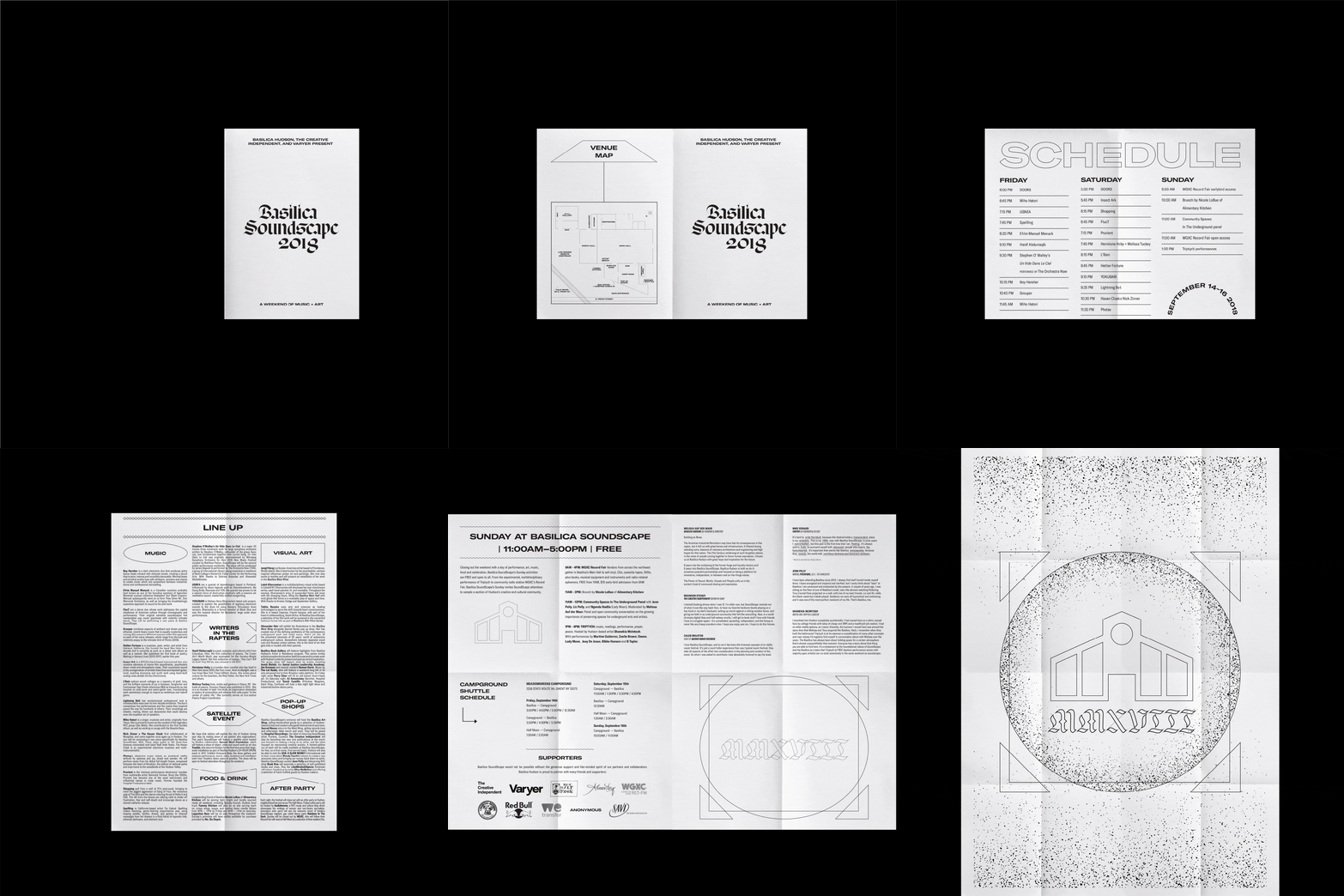
Newsprint schedule that unfolds to reveal a 24x36 poster.


Artists include Wax Idols, Tabita Rezaire, Nick Zinner x The Haxan Cloak, and Boy Harsher.


Custom socks for sale during the three-day event.
Shirt tag detail.

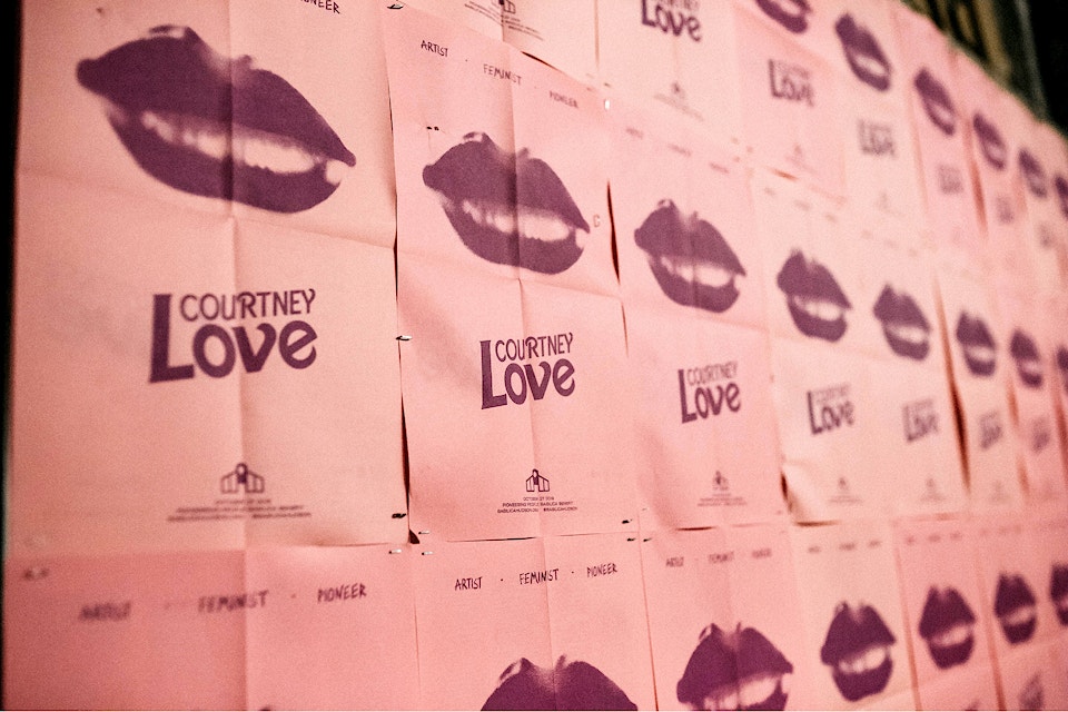


Courtney Love and Melissa Auf der Maur perform at a Pioneering People event at Basilica Hudson.
Reframing the experience
After paying a visit to the space to attend the seminal Basilica SoundScape, a weekend of no holds barred adventures in music and art, we had been indoctrinated. With the vastness of the space in mind we set out to mimic its architecture that had been stripped down to a core structure.

Our inspiration: built in 1880 as a forge and foundry for steel railway wheels and later housing a glue factory until the 1980’s.

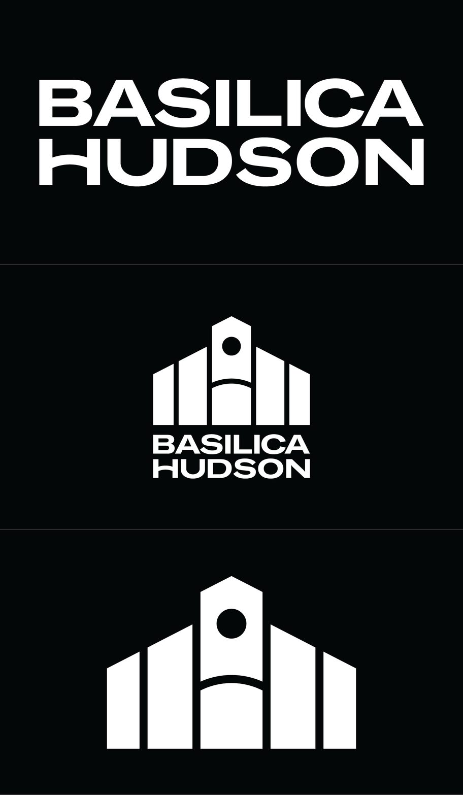
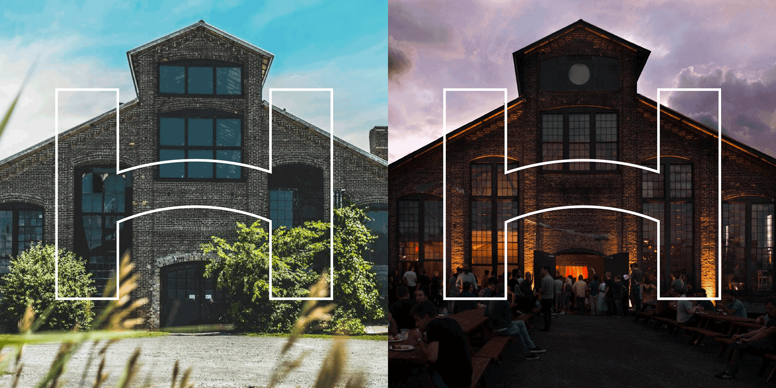
Logo construction inspired by the buildings skeletal form.

Basilica Hudson has since been stripped down to its architectural bones.
This team is the dream combo of humane technology and artistic integrity!!!!


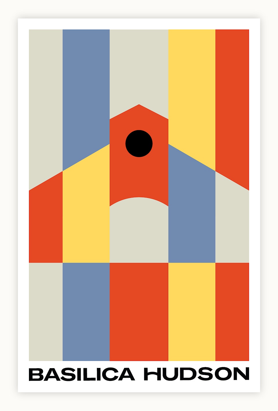

A contemporary and inviting palette—a heavy black balances the light, delivering a visual punch.

Implementing the newly established stained glass color block designs for upcoming events.


Risograph prints are sold at in-house events.

Commanding attention through type
Basilica Hudson was given a custom logotype using GT America by Grilli, a strong typeface considered to be a bridge that links 19th and 20th century type styles together, just as the building is a link from 19th century industry to the thriving art community of today in Hudson. Its custom capital H is directly inspired from the building's arched entryway, a nod to open doors and the welcoming feel of Basilica.
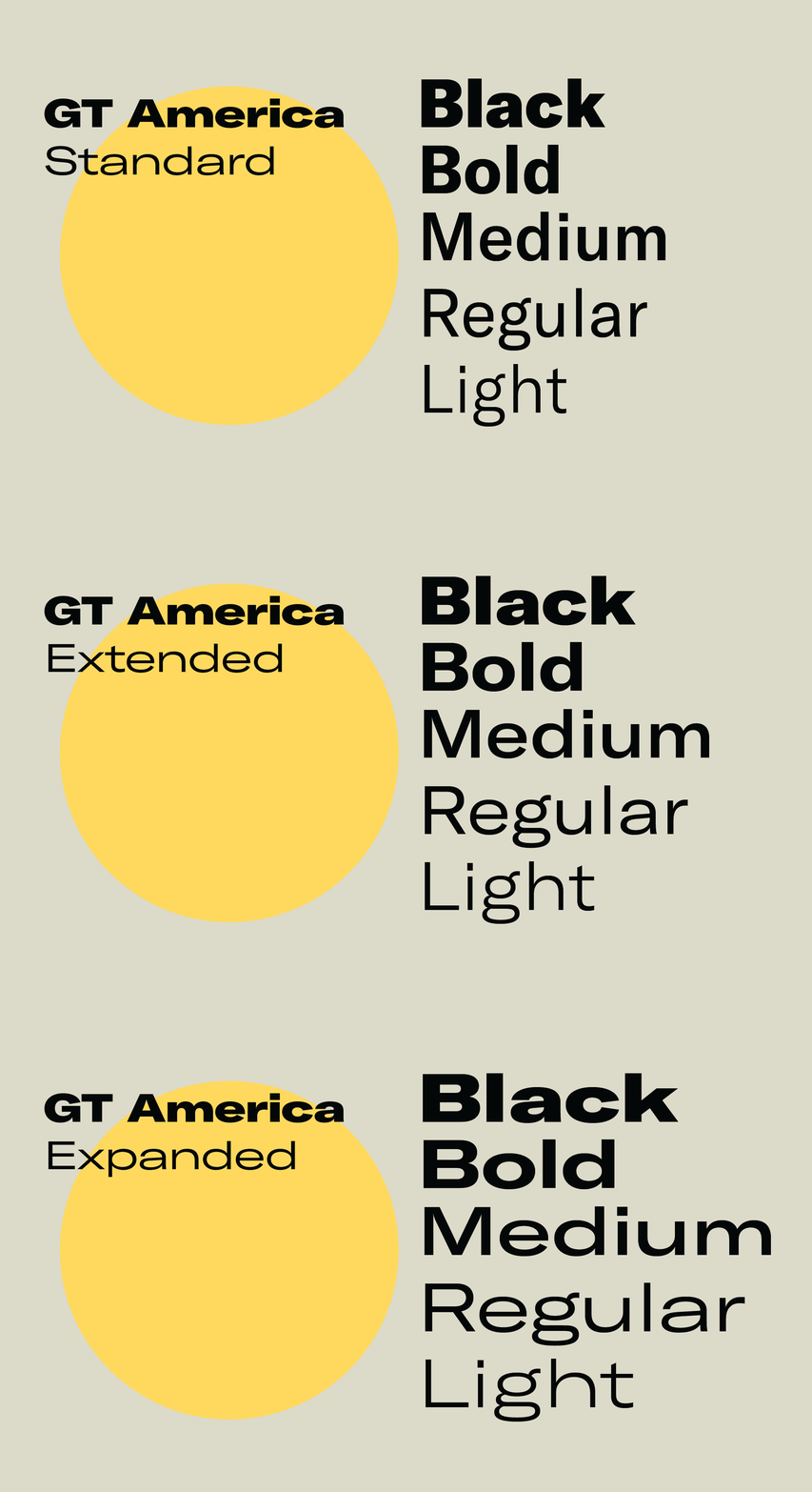
Using dynamic type: Expanded Black for large headlines, various Extended weights for smaller headers, moments of typographic emphasis, and body copy, and Bold and Regular for standard body copy.



A reconfigured logomark for the 10-year anniversary.
Perfectly connected pieces, endless combination
The modular system utilizes key elements for core programming. These motifs are easily applied to various templates for visual consistency year over year, event by event.

Examining underlying structures of the system

Distinct marks for individual events
Each event series has its own logomark, colors, and typefaces. Overall designs reference stained glass, with structural elements in bold, interchangeable colorways. Individual photographic treatments and typefaces further set the series apart from one another visually.


Basilica Soundscape — A Weekend of Music + Art

The Basilica Green Energy Fair focuses on exploring both community solar and bioenergy.

24-Hour Drone is an immersive, constant 24-hours of experimental and experiential music


The Basilica Back Gallery Artist In Residence Series invites artists to explore the location itself as muse, creating work with the eclectic present and past of Hudson as their central inspiration.

Basilica Non-Fiction Screening Series explores the independent documentary genre through screenings and dialogue with visiting directors.


As darkness falls over Hudson’s annual Flag Day parade, (FREAK) FLAG DAY celebrates the weird within.

The biennial Pioneering People fundraiser celebrates groundbreaking artists across a range of disciplines.

Basilica Farm & Flea is part timeless flea and farmer’s market, part 21st century craft and design fair.
The cross-pollination of sophistication and wild abandon
The Basilica Hudson design system stands out on the horizon, stripped back yet somehow commanding. Its bold lines and colors draw the attention of the artistic and curious, for which its programming is directly curated.


We had the honor of working on Basilica Hudson's Kickstarter campaign, raising money for future programming and events to support creatives during COVID-19. The project was fully funded in just over 48 hours!